 |
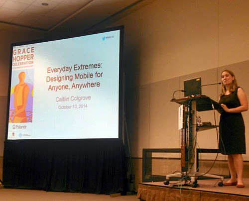
| Caitlin Colgrove presenting on extremes in mobile design. |
Of the 6 HCI talks presented on the last day of GHC, 3 were website-related and 3 were mobile device-related. I know these two areas (websites & mobile devices) have a strong presence in our everyday lives and there’s still much to learn and actually execute in terms of their usability – especially as technology continues to evolve. However, I would have liked to have seen at least one presentation related to some other type of human-computer interaction – automobile dashboards, airport kiosks, gas pumps, etc. Rather than try to cover all 6 presentations in this post, I’ll focus on my favorite and then end with my biggest takeaway from each.
The 3 website-related presentations were:
- Designing for a Digital City: Advancing the Online Presence for a Municipal Government, by Carolyn Pang
- Accessible Web Sites Are Always Ugly and Other Myths by Christine M. Ingalls
- Web Accessibility for Everyone by Ramya Sethuraman
The 3 mobile device-related presentations were:
- Hitting Authentication on the Nose: Using the nose for as an alternate authentication input, by Ann-Marie Horcher
- Distractedly Intimate – Your Users on Mobile, by Cate Huston
- Everyday Extremes: Designing Mobile for Anyone, Anywhere by Caitlin Colgrove
My favorite presentation was Everyday Extremes by Caitlin Colgrove because she touched on HCI concepts I find most fascinating: context. She encouraged us not to view mobile as “just a miniature version of a desktop” and to consider the extreme conditions that mobile users encounter on a daily basis. The case studies she brought up highlighted the importance of observing how environment impacts usage. One great example was when her team was tasked with deploying an interface law enforcement officers would use in their cars. They noted the laptops in the officers’ cars had hard-to-press, pressure-based touch screens that were even harder to press when the vehicles were moving. They noticed that officers would brace the screen with their one hand (usually right hand) and use their thumb to press. So, they designed for this, putting the interface’s navigation controls in the upper right.
Another great example – which became really relevant to me immediately following the presentation – was the issue of designing for slow and no internet connectivity, not just good and great connectivity. She discussed the need to:
- let users know what’s going on when tasks aren’t responding due to a slow connection
- enable users to do something offline when there’s no connection
- allow users to take action during a slow connection or to recover from a lost connection (allowing retries or cancellations, setting reasonable timeouts, etc.)
She also advised us to check out the blog post “Design for Realtime” by Dominic Nguyen.
This hit home when, following the presentation, I decided to continue my note-taking outside where it was warmer. I kept my laptop open, walked out the closest door and sat out front of the convention center. I finished up my notes in the wiki, hit Save and … eeek … a “no connection” screen. I didn’t realize that I’d lost connection to the conference center wifi went I walked outside. I hit the Back button, but it was too late – all my notes were gone. Luckily, I’d done an earlier save of my wiki notes into a Word doc so I was able to repost everything.
My top takeaways from the other talks:
- We have a dominant nostril that changes several times a day. From the quite interesting and entertaining talk "Hitting Authentication on the Nose" by Ann-Marie Horcher.
- The discussion of the Couple app (which I loved using during my 2 years of long-distance dating my now husband!) and how it allows you dedicate a “space” on your device for the person you love, similar to how you might dedicate a particular ringtone. From "Distractedly Intimate" by Cate Huston.
- When we think about making websites more accessible, imagine we’re fixing a site for Stephen Hawking or for our future older selves. Great perspective from "Web Accessibility for Everyone" by Ramya Sethuraman.
- There are a lot of myths in accessibility design! From the very digestible and insightful talk "Accessible Websites are Always Ugly and Other Myths" by Christine Ingalls
- Cities are only just now exploring how digital technologies can connect them to their citizens. From "Designing for a Digital City" by Carolyn Pang.
Great talks overall. I've posted my notes and look forward to seeing the speakers provide slides. Maybe next year, I'll have to be the one to present my observations on gas pumps!


